Banner

Bannner

Wednesday, April 25, 2012

Art Nouveau


The Art Nouveau in French means 'new art' and was replaced by modernist style. This movement was inspired by natural forms and structures, in flowers and plants but also in curved lines. During this period show a revival of crafts and of craftsmanship and the development of new typography and graphic design and also the introduction of new materials such as opals and semi-precious stones.

 “Art Nouveau had no claim to novelty but it was genuinely new whenever it sought unusual, original effects and was colourful consistent, harmonious and functional prefiguring the shape of things to come- The Bauhaus, Surrealism and abstract art.”                                                                                                                           

Art Nouveau is known as a style of ornamentation which was designed to made part of ordinary life and was frequently used for covers of novels, advertisements, and exhibition poster and marketing.

They wanted to create a new style which would continue a tradition but not copy it, so the Art Nouveau was inspirited by distant and exotic civilisations like Turkish, Persian and Moorish but especially the Japanese.


“The discovery of Japanese art and their influence on painting was important …. Inspire painters with new outlook or new typographical composition or page layout.”

Another characteristic from Art Nouveau was the frequent use of the woman figure as an allegory and sensuality but the woman figure was use to sold making them the ultimate symbol of the modern consumer world, this strategy combining women with products to sold a lifestyle dream.

“Woman passive and subservient… the lie of woman was controlled by fashion and any feminine gesture might supply the subject matter for a supposed work of art.


Quotations

‘Sources of Art Nouveau’                                                                                                                                                                                             Stephan Tschudi Madsen (1975) by Da Capo Press- New York


Carrie Mae Weems


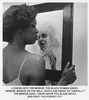
Carrie Mae Weems is an American photographer and artist from Oregon, she abroad the issues about African American and their status on their own country. She is documentary photography and incorporating text and mixed the use of photography, text and images.

“This personal work extends into a metanarrative on the complexities of race, gender and class on American life.”


Carrie Mae Weems is focused in show and inquires about gender roles, racism, sexism and social class and she portray it in a beautiful and powerful way and always tried to storytelling about human conditions this is complement with overtones of humor and sadness of the picture or text. She questions the structure of society through her pictures.

“Used the format of documentary photography and intimate stories about her own family to portray people who are no likely ever to see themselves in work of art.”

One of her best works is Mirror, Mirror, this pictures draw attention because it can be read like a joke using an innocent  line from the story of Snow White but also you can see beyond that and understand that is talking about racial differences in a subtle, yet powerful way.

 “Crude visual and verbal jokes based on racial stereotypes that aren’t funny.”


Quotations

‘Feminism and Contemporary Art’                                                                                                                      Jo Anna Issak (1996) by Routledge


Sonia Boyce


Sonia Boyce is a British Afro-Caribbean artist; she is an important figure in the burgeoning black British art-scene of that time.

She works with her identity differences and black culture, using diverse methods like photography, installation and text, her works talk about racial identity and gender in Britain.  She was inspirited by the work of Margaret Harrison from Phoenix – the Feminist Art Collective and National Convention of Black Artists at Wolverhampton College of Art in 1982

In the 1980s she used to show her work through drawing using large chalk-and-pastel drawings and talk about personal experience of her family and friends but has since diversified into photography, mixed media and installation and in more recent years seem like Boyce is returning to drawing again.


Sonia Boyce likes the use of wallpaper patterns and bright colours which are associated with the Caribbean, she likes to used her own personal background and talk of how is to be a black woman in Britain, about the stereotypes in the media and daily life.

... to demonstrate how cultural differences might be articulated, mediated and enjoyed without oppressive compulsion or inequality.”

Quotations

‘Traveloque’                                                                                                                                                       The Whitworth Art Gallery (2002)


Peter Saville


Peter Saville is an English art director and graphic designer. He studied graphic design at Manchester Polytechnic.

During the 1980s, he designed record sleeves for Factory Records for artist like Joy Division and New Order. He became a pioneer of graphic design and culture. These projects mixed with music resulted in remarkable images and elegance as form of self-expression to articulate visual narratives of his life. Saville work with different photographers to design his work and experiment with new techniques of photography and typography.


“That his designs were so entertaining and electic they were simply unlike anything else in the pop world and he was himself using these sleeves to develop a narrative that was his own personal history of graphic design.”

Saville’s reputation consolidated him as a designer of music graphics and this commercialization and excess of work make him works in other areas like fashion and made exhibition and collaborated with other artist.

In 1990 to join the partner-owned Pentagram, disillusioned with design and filled his work with images of exhaustion and depletion, Saville left Pentagram in 1992 and started his own studio in Mayfair. Since then his art is dedicated to the young generation and in his personal projects.


Quotations

‘Designed by Peter Saville’                                                                                                                         (2003) by Frieze/Imprint of Durian Publications Ltd.


Dorothea Lange


Dorothea Nutzhorn (Lange) was a photographer from New Jersey. Dorothea changed her last name for her mother's maiden name, when her dad abandoned the family.
Dorothea Lange had opened a successful portrait studio until the Economic Depression in about 1929 and is when she takes interest to show the consequences of the Great Depression. She develops a Documentary photography and used it to chronicle this historical event. Her pictures was focused on humanized the Great Depression and to show how people were affected by this event, she portrays families and the unemployed, women and kids, she portrays the real society.


“… But to imperfect people whose actuality was most likely to be realized in the physical and social circumstances in which they were spending their lives.”


She also shows interest to the evacuation of Japanese Americans to relocation camps after the attack on Pearl Harbor. With her pictures criticized the government because the detaining of innocent people without charging them with any crime.


“She was picturing some of the disgracefully invisible people of our society, making them visible to all with humane eyes to see.”

Dorothea has a critical eye that allows her to see beyond the simple things with her camera takes photography of the real human condition, she portray the essence of the subject and makes artistic photographs.


Quotations

‘Dorothea Lange with an introductory essay’                                                                                           George P. Elliott (1966) by Doubleday & Company, Inc


Paul Cézanne

Paul Cézanne was French and Post-Impressionist but between Impressionism and Cubism combined the pictorial style and reducing figures to geometric forms, he has a unique treatment of space, mass, and color.

“The logical extreme of such a method would undoubtedly be the attempt to give up all resemblance to natural form and to create a purely abstract language of form.”


Paul Cézanne has financial security because his father was a banker; he was studying in Paris, first began to study law but later studied art. Cézanne's early pictures of romantic and classical themes are imbued with dark colors and expressive brushwork eventually he changed for bright colors and paint landscapes like Bathers and The Fisherman. The Impressionism start to show is his works like Still Life with Apples and a Pot of Primroses. Cézanne had a system to give more dimension and to take the viewer into the painting, this is appreciate in his many landscapes he created like Mont Sainte-Victoire and the Viaduct of the Arc River Valley. Later Cézanne start to development geometric and volumetric patterns form in his work like in Gardanne.


aul Cézanne compositions were mostly landscapes but also he develop a style of building forms completely from color and creating scenes with distorted perspectival space and he also drawn landscape and figures from his imagination.


Quotations

‘The End of Art Theory: Criticism and Postmodernism’                                                                          Victor Burgin


Barbara Kruger

Barbara Kruger is an American artist from New Jersey, she study in Syracuse University,  she studied with fellow artists/photographers Diane Arbus and Marvin Israel and later she work at Mademoiselle magazine.

Barbara works involve conceptual artist and the use of image on black and white mixed with text in red. The contrast between this images and text, show to different kind of view difficult to coexist. But together contain a message of critic about sexism and power over the cultures.

“I am interested in works that address these material conditions of our lives: that recognize the uses and abuses of power both an intimate and global level.” (Barbara Kruger, 1982)

During her early work she was more focused in feminism, politic, social, racial, gender stereotypes and consumerism and started to develop her techniques as a graphic design. This works were addresses to calls attention to the people using ironic text and simple image. In recent years creating public installations like bus or billboards, wall to assault the viewer and critique the modern American culture.

“The early work may have been more psychoanalytically inflected and later work more focused on late capitalism’s consumerism, it always addresses the complex interconnection of gender and the marketplace.”


Quotations

‘Feminism and Contemporary Art’                                                                                                                    Jo Anna Issak (1996) by Routledge